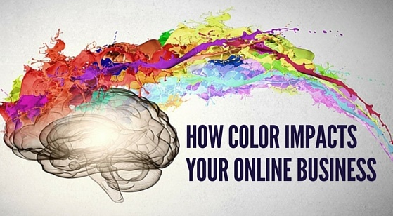
How Color Impacts Your Online Business
Colors impact everyone. It doesn’t matter whether you are developing software or branding your business, the colors you use will define your audience’s mood and influence their response. Color has a massive influence on our attitudes and emotions, and thus the decision we make. The color schemes an online business uses can encourage people to click a call-to-action button, browse a website longer, or make a purchase. Using the right colors can also give a business an edge over the competition and convey messages effectively to meet the needs of their target audience. However, not just any color will do. There is actually a science behind how people react to colors that many online businesses are beginning to tap into to increase their sales.
Color psychology is the study of how color influences the decisions people make. Color psychology allows online businesses to predict how customers will respond to marketing messages based on the color of the copy, call-to-actions and links. And more importantly, when a business has a clear understanding of color psychology, they can use that knowledge to boost conversion rates. Research from QuickSprout even indicates that “90% of all product assessments have to do with color and color is 85% of the reason shoppers purchased a specific product.”
So, bottom line, the proper mix of colors can actually increase an online business’s sales. But color is a tricky thing and you have to use it in the right way with the right audience. We have gathered a few tips and facts to help you start incorporating color psychology into your landing pages or website.
Studies show that women don’t like gray, orange and brown; they prefer the colors blue, purple, and green. Most people think that the majority of women love the color pink but just a small percentage actually choose it as their favorite color. So if you are trying to improve the appeal of your site or marketing efforts to female visitors, use blue, purple and green to improve your conversions. Men, on the other hand do not like purple, orange and brown so stick to blue, green and black when targeting male visitors. Children and younger generations tend to prefer warmer colors associated with positivity and high energy like red, orange, pink and yellow.
Yellow is seen as a color of warning, which is why it is used for things like warning signs and traffic signals. Brands, on the other hand, use yellow as a way to show they are fun and friendly. Yellow stimulates the brain’s excitement center so the playful, fun feeling associated with yellow may be a result of heightened emotion and response, not sheer joy. For an online business, heightened emotion during any website experience is only a good thing in small doses. Thus, something like a yellow call-to-action may create just enough emotion needed to increase conversions.
Green is very easy on the eyes, which gives site visitors a more relaxed feeling while browsing. Green is also common on websites passionate about environmental issues. Studies show that when customers see green on a site, they tend to feel calmer, more comfortable and confident when making a purchase decision.
Blue is one of the most-used colors but with good reason. A lot of people like blue because it conveys a feeling of trust, serenity, and efficiency. If an online business wants to be seen as trustworthy and efficient, try using blue in strategic locations on a landing page or website.
Orange can be used a fun color and some suggest that it helps stimulate physical activity and confidence. Orange also suggests urgency, which make messages more noticeable and actionable. But orange can also been seen as overwhelming. If it is used excessively, the color may be overpowering and ultimately distract shoppers.
Red can be a great color to draw attention to an element, like a call-to-action. It is one of the highest-converting colors for call-to-actions along with green, orange, and yellow. Red can also be overwhelming so it needs to be used in moderation.
The color black suggests power and luxury. It is an excellent color to use if your business deals with costly and luxury items because it drives confidence to shoppers.
White is primarily used as a background color because it contrasts well with a majority of text colors. Most well designed websites today use plenty of whitespace to create a sense of spaciousness and breathability.
The internet is a colorful place and an online business can accomplish a lot by using color in the right way, with the right audience, and for the right purpose. Regardless of what your business is selling, it is essential to ensure that your colors are working correctly within each aspect of your marketing efforts. Keep in mind that not one particular color is “best” and you will need to test different color options to discover what works best for your business.